Building Visualizations in Amazon QuickSight
Making Data available for Amazon QuickSight
Amazon QuickSight allows you to build visualizations based on “data sets”, which can come from different sources – relational and some non-relational databases, data warehouse solutions like Amazon Redshift and Amazon Athena, too .
When building a visualization, Amazon QuickSight translates the selected rows, columns, filters etc. into (SQL) queries and then either queries the underlying data store directly, i.e. a single visualization using a data set backed by Amazon Athena would result in a SQL query sent to Athena, or you can import the data set into SPICE, Amazon QuickSight’s in-memory calculation engine.
Managing Permissions on the Data source
If you just add a Data Set using the Athena data source, you will notice that QuickSight does not see any tables in Athena. The reason, of course, is that we have not granted permissions to the QuickSight service to access our data!
QuickSight brings its own user and permissions management, which makes it easy to integrate with various authentication providers. While the QuickSight users are authenticated within the service, the Amazon QuickSight service itself uses a “service role” to authenticate its access to other services. As a consequence, what we need to do is to grant access to the Amazon QuickSight service to our data in Lake Formation in order to expose this data to QuickSight as a new data set.
One last time, we had back to the Lake Formation management console and open the “Data permissions” screen (under the “Permissions” header), then grant “Select” permission on the factoryevents table to the Amazon QuickSight service role:
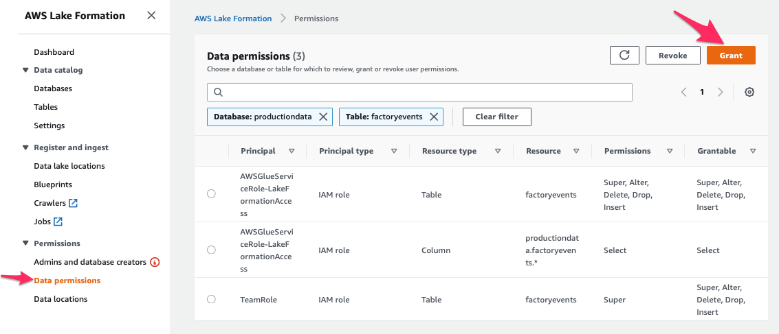
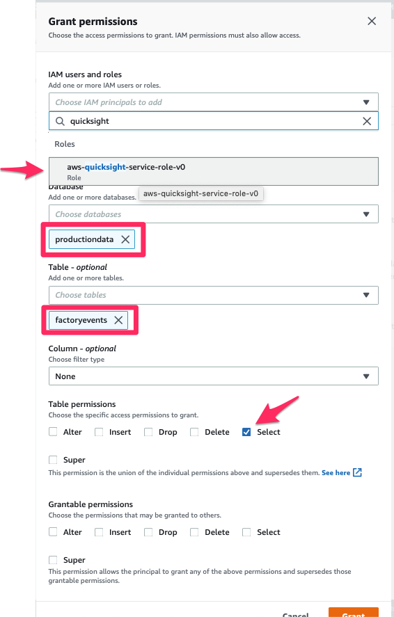
Once you pressed the “Grant” button, you’re all set! The table productiondata.factoryevents is now available for QuickSight to read. Let’s open Amazon QuickSight again.
Adding a Data Set for the “factoryevents” table
We create a new Data Set by connecting QuickSight to our Amazon Athena Data Source. Specifying "productiondata" tells Athena which database to connect to, so we can select the table to use for our visualization.
If we only want to read data from this one data source and not modify it in any way, we could “Save” this new data set and start building visualizations; instead, we open the “Edit / Preview” view. This view allows us to rename fields, change formats, add calculated fields, join with data from other sources etc. – for instance, it looks like we did not properly define the schema for the "dt" column: it shows up as "string" since we’re using a date format that QuickSight does not recognize. That is easy to fix in QuickSight, however, and can serve as an example for the kinds of data manipulation you can do.
We leave the rest of the data as-is, but import our data set into SPICE for faster processing.
The following video provides you with a quick overview of the required steps:

Visualizing Data
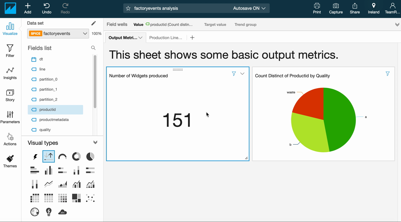
Now we are able to build the first visualizations based on our factoryevents table. At first, we’re setting up dashboard with a set of basic metrics. First, we want to see the output of our production line: how many products do we create? How much waste do we produce, i.e. are our quality metrics OK? In addition, we will create a (very coarse) view of our equipment health by tracking which stations had to be suspended most often.
The raw event data in our “factoryevents" table is a bit unwieldy but it offers a direct view into how events unfolded and what impact that has over time. This allows us to quickly analyse, for example, how our quality level and overall output changed over time:
Creating Data Sets Based on Custom Queries
We have seen how to generate simple visualizations based on the data in our factoryevents table and also how to make some modifications to our data set, e.g. changing some of the schema information. You can also do more, like add calculated fields, integrate machine learning to make predictions (based on the existing data) into your data set or join data from different sources directly within QuickSight – that, however, would be out of scope for this workshop.
However, sometimes the simplest option is to formulate a custom SQL query that gives you the data you want, encapsulate that into a purpose-built data set and then build your visualizations on top of that. For example, the following bit of SQL helps to list all the different stations that were involved in producing a particular productid:
SELECT a.productid AS productid,
         quality,
         array_join( array_distinct(array_agg(station)),
         ', ') AS path
FROM
    (SELECT station,
         productid
    FROM "productiondata"."factoryevents"
    WHERE state='EXECUTE'
    ORDER BY  dt ASC) AS a
JOIN
    (SELECT productid,
         quality
    FROM "productiondata"."factoryevents"
    WHERE quality is NOT Null) AS b
    ON a.productid=b.productid
GROUP BY  a.productid, quality
ORDER BY  a.productid ASC;
When combined with the productid‘s quality grade, this data should give us some insights into how likely a certain path through our production line is to impact product quality overall. Doing this in SQL is simpler than trying to do the same via QuickSight’s UI, so we will just use this query as a custom data set for our analysis. The following video shows you all the required steps: